code snippets
things for you to use in your own site, if you want to! if you do, i'd appreciate a link back here in your 'credits' page, or wherever else you keep that sort of thing.
for anything here that involves javascript, you'll need to have jquery active on your page as well — just copy-paste this into your head section.
"new" navigation icons
a code-only alternative to those cute little 'new' icons, to show what pages you've updated recently!
html:
css:
autoload script
to put the same navigation & etc on every page!
note: when testing your files locally, the autoloaded content won't show up — i'm not sure of a way around this tbh, but it should work fine once you launch your site to the web!
for the sake of this example, i'm going to assume the parts are as follows (and you can change the names of these accordingly in your own version, if needed!)
mypage.html - this is the page you want your navigation content to load onto.
div id="nav" - this is the section on each page where you want your navigation content to go. it should be empty, since the content inside of it is going to be loaded in separately.
nav.html — this is the html file where you'll put just your navigation content.
autoload.js - this is your javascript file, where you'll tell the page what content (nav.html) you want loaded in what location (div id="nav").
in your mypage.html file:
in the head section of your page, put:
inside the body of your page, wherever you want your navigation content to load in, put this and leave it empty:
at the bottom of your page, before the /body, put:
in your autoload.js file:
you can even use the same autoload.js file to load multiple elements — for example, i also use this file to load updates onto both my homepage and my updates page, so my autoload.js file looks like:
finally, in your nav.html file, just put whatever content you want autoloaded into the div id="nav", and voila! it should work! you may have to do a hard-refresh (command+shift+r on a mac) for it to appear for you.
image toggle navigation
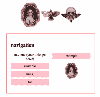
protomartyr asked me in my guestbook how i did my new navigation on my homepage, so here's a little tutorial!
extra info about the pieces of this code:
#nav: contains all of your navigation sections.
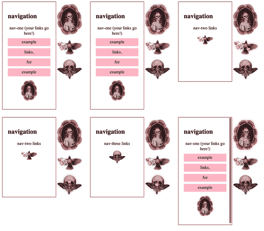
.navcontent: each section of your navigation. each one will also have a unique class — nav-one, nav-two, etc, or whatever you want to name them, just make sure those classes match up with the id on the navimg.
#navimg: this area contains all of the images you want to go along with your navigation, which people will click on to reveal other navcontent sections. each image inside the #navimg div will have an id (nav-one, nav-two, etc) that corresponds to its navcontent section.
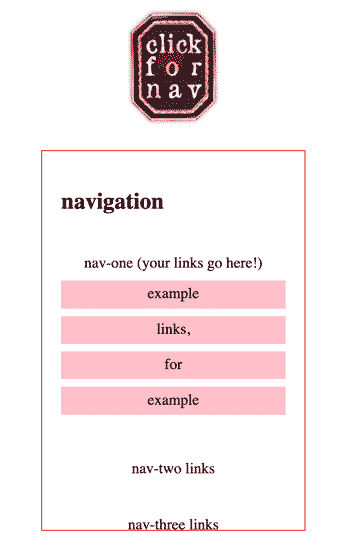
small screen compatibility: the css has two sections to adjust things for smaller screens. on screens less than 800px wide, it'll make the navigation more horizontal. on screens 450px or smaller, you can replace the navimgs with a 'navall' image, which people can click to reveal all of the navigation sections at once, to make things less cluttered.


accessibility: i've done my best to make it clear that the navimgs are there to be clicked on — they'll tilt to the side and glow a bit when hovered, and the cursor will turn into a pointer. unfortunately, this navigation layout isn't accessible for people using only keyboards to navigate through a page, and i'm not sure if there's a way to make it accessible for screenreaders, either.
using this with an autoload script: if you want your nav to be the exact same on every page, including the images, you can just slap this entire code into your autoloaded nav.html (or whatever you name it) file, and match it up with a div id="nav" (or something) on your pages.
personally, i wanted to only have the image-based nav on my homepage, and have a details-summary style navigation on other pages. if you want to do that, you'll have to screw around with the css a bit to make it work correctly, and you'll want to only have the autoloaded section be where i have div id="nav" here — so only the navcontent sections get autoloaded, and not the navimgs or the article itself. (if y'all are interested in a more detailed tutorial about this, let me know!)
html:
jquery:
css:
page section toggler
this is the code i use on pages like my media log, site materials, & scrapbook pages. it'll make some of your page content visible on load, and some only visible when the corresponding link is clicked, like the above image-based navigation. it also adds a #hashtag at the end of the url, and navigated to that hashtag's corresponding content on page load, so you can link someone directly to one bit of your page!
i'd recommend not using this on pages that also rely on #anchor links for anything, since (as you can see if you click any of the page navigation links at the sidebar of this page and then refresh), having an anchor link in the url that doesn't correspond to page content just hides all the toggled items. probably not a huge deal, though.
jquery:
html for the page navigation:
html for the page content:
count list items by type
i use this on my media log page to count how many of each type of media i've listed. you can use this to count anything — just make sure the span#id in your stats html & the li.class in your lists html match up.
jquery:
html (stats):
html (lists):
blaseball stats box
for making player stats like in the now-dead browser game blaseball!
for the stars you'll need a free tier acc on fontawesome, or you can figure out your own stars system (unicode doesn't have half-stars universally yet, but if you don't need those then ★⭑✭✮✩⭐︎ these should work!)
css:
html:
Rosemary Hillhouse
👻 Hill House Poltergeists
INFO FEED
| Current Vibe |
|
| Batting |
|
Pitching
|
|
| Baserunning |
|
| Defense |
|
| Pregame Ritual |
Batting Practice |
| Coffee Style |
Latte |
| Blood Type |
Electric |
| Fate |
6 |
| Soulscream |
AEUOAAEUOAAIAEAAHEEAAHEOUOEOOUOEOOEOEEIEOEEIE |
washi tape
here's how i add washi tape to the top of posts, like on my scrapbook page! just add class="taped" in the html for any element you want to add tape to, to give it a neat scrapbooky look.
basic code:
corner tape - i use this for extra small elements to make sure the tape doesn't cover any words at the top
adding pseudo-randomness — this will change the tape image & position when you have several .taped elements in a row! i'm sure there's an easier way to do this with js, but this is how i've done it for this site so far.
this is what it'll end up looking like!
you can use tape images from anywhere
just make sure it's a transparent png that's smaller than 150px x 50px
i have several washi tape pngs on my materials page you can use if you want!
you can make the elements have paper backgrounds like these for bonus scrapbook energy!
go wild!
